How many times a week do you agree to some endless block of legal terms and conditions in order to access a website or install some software? How often does your phone company, stock broker, or credit card company send you changes to some contract in the mail?
Of those, what percentage of the time do you actually read and understand the blobs of tiny print?
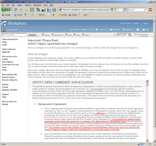
I logged in to iStockPhoto for the first time in a while and was confronted by a change to the artists’ agreement. I was shocked, absolutely flabbergasted, to find the document clear and easy to read. I’m not sure this has ever happened before. I actually understood what they were talking about. Here’s a screenshot:
A few pointers on how to construct a similarly user-friendly legal document:
- Put a quick, “plain language” description at the top.
- Highlight text changes by coloring the new sections and visibly crossing out the removed text.
- Include convenient contact information at the bottom for further help and information. By convenient, I mean convenient for the reader, not convenient for your company.
Legal document usability is so bad at this point that I would advocate changing the law so that any terms document that didn’t meet the three point above would be automatically null and void. Kudos to iStockPhoto for getting it right.
