Category Archives: Blog

Academic Papers Artwork baby names Blog blogging democracy Design ethics Facebook firefox Flickr folksonomies Google Google Docs Google Spreadsheets how-to information-architecture information-retrieval information design internet iphone journalism listserv mailing list maps mass media Online News Papers Photography plugin poll social-bookmarking social networking social software spam tagging trust Twitter Usability web-development Web2.0 webspam web standards WordPress Writing

Twitter user directories – Wefollow vs. Justtweetit vs. Twellow

I happened to notice Brian’s tweet that he is officially the sole authority on burritos in Twitter, at least according to Wefollow, a Twitter user directory.

Twitter is the only major service I can think of where sites have popped up to provide a function so basic as user directories. This is due in part to their great API, but also because they don’t provide any real functionality on their site. You can search for users individually and import your contacts, but the suggested user page seems uselessly weighted toward the most popular people on the entire site.

Who should I follow if I’m interested in usability or cartography or legume horticulture? I took a look at a few directories, which follow slightly different models:

justtweetit.com
– Has a list of predefined categories
– Each user can only be in one category
– Users are self submitted

wefollow.com
– Users can be tagged by any word or phrase, though the most popular show up as main categories on the home page
– Each user can use up to three tags
– Users are self submitted

twellow.com
– Has predefined categories, a large list that looks similar to Open Directory.
– Each user can be in up to 10 categories
– Seems to pick up users automatically, but users can add themselves to additional categories

My guess is the more specific the categories, the more useful the organization system will be. Wefollow gets points here for allowing open tagging but the front page, with such broad categories, isn’t as useful as the search or drill down pages. Twellow actually works pretty well, since the built-in category list is so extensive.

All three seem like they might be a bit open to abuse, since users can add themselves to the directory – with Twellow and Wefollow, at least they have to be logged in to their account to do so. But if I were a spammer and had found some way to use Twitter for spam, I could quickly add my spam accounts to these sites as well.

It would be really interesting to see a measure of quality other than just the number of followers. For example, if I say I’m in the haberdashery business, the system could check to see how often haberdashery shows up in my tweets – that could be a quality score for the classification, used in concert with number of followers, which is a proxy measure for the quality of my account.

Has anyone else used these directories, or others? Would you follow someone just because they’re the most popular person listed in your area of interest? Let me know in the comments below.

User interfaces should be made as simple as possible, but no simpler

When designing a user interface or doing a usability review of an existing website, simplicity is an extremely important goal. When I get to your interface, don’t force me to spend time thinking. Make it easy for me to do what I want to do.

Here’s a perfect example: ever wish you had remote controls that looked like this?

simple remote control

Like anything else, though, don’t take the drive for simplicity and turn it into an inflexible dogma. Make sure your UI simplification efforts stop before your interface is:

… so simple it doesn’t give users any cues. This is a classic Web2.0 sandtrap – yes, your site looks very modern and clean with one giant button, but what does the button do?

… so simple it doesn’t do what the user wants. Here’s a great example of oversimplification from Tim and Eric Awesome Show:

It’s great – users have expressed frustration in getting calls when they’re at dinner or trying to enjoy a relaxing round of golf – so they’ve taken away the ability to get incoming call. Problem solved.

… so simple that important efficiency gains are lost, requiring users to expend repetitive manual effort. The Cinco Fone example above fits this one as well, but here’s another fun satire from the Onion News Network about the Macbook Wheel:

I’d love to hear any example of websites that you think might be committing one of the three sins of over-simplicity, please add a comment below.

Also, ff the title of this post is familiar, it’s because it’s based on a quote often attributed to Albert Einstein. The actual quote is:

It can scarcely be denied that the supreme goal of all theory is to make the irreducible basic elements as simple and as few as possible without having to surrender the adequate representation of a single datum of experience.

President Obama vs. Governor Jindal by Word Cloud

In the world of political blogging, the President’s speech before a joint session of Congress (basically a state of the union speech) is already ancient history, but I thought this was interesting enough to post. I’ve mused before on how word clouds and tag clouds can be useful – here’s a nice qualitative example.

Here’s a word cloud of President Barack Obama’s speech – major themes are apparent in large type, such as “economy” and “health.” You can also tell something about the urgency of the speech, with words like “now,” “new,” and “plan” showing up rather prominently.

Word Cloud of Obama's speech to Congress

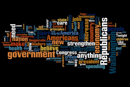
Contrast with Louisiana Governor Bobby Jindal’s response, seen below. The three most dominant words are “Republicans”, which is understandable, “government” and “Washington.” I think this illustrates pretty clearly the thrust of Jindal’s speech, that the federal government can’t do anything right.

Word Cloud of Gov. Jindal's GOP response to Obama's speech

This isn’t a political blog but I do want to give a quick shout out to all the geologists out there who do important work like monitoring volcanoes. It’s ridiculous that Jindal, running a state that lives and dies based on natural disaster monitoring, would call out volcano monitoring as his example of pork spending.

Both word clouds made at Wordle.