Category Archives: Blog

Academic Papers Artwork baby names Blog blogging democracy Design ethics Facebook firefox Flickr folksonomies Google Google Docs Google Spreadsheets how-to information-architecture information-retrieval information design internet iphone journalism listserv mailing list maps mass media Online News Papers Photography plugin poll social-bookmarking social networking social software spam tagging trust Twitter Usability web-development Web2.0 webspam web standards WordPress Writing

A Scary, but Fascinating Idea – Javascript and CSS hack to see where your users have been

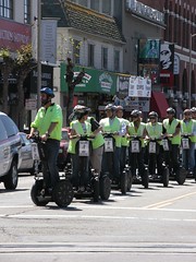
Invasion of Segway infantry!

I just ran across this post on Aza Raskin’s blog about a technique used to cut down the number of social bookmarking links displayed to users.  I’m sure you’ve seen them–the 20 or so colorful buttons that have popped up at the bottom of every blog post on the web, for Digg, Del.icio.us and similar sites.  On my blog they are hidden behind the ShareThis Widget but Raskin had a better idea – why not just display the ones each user actually uses?

Impossible?  Not so fast – think about what happens when you visit a site.  After your visit any links to the site will change, usually from blue to purple.  We can put up links to each social bookmarking site and then use Javascript and CSS to check to see if each link has been visited.  If so, display the button, and if not, hide it.

This is a very cool way to manage buttons but the technique has wider privacy implications.  I could, for example, put links to…  questionable sites, and then use some Ajax to collect that information about users.  If I had other information about you (say you logged into my site or otherwise gave me an email address) I could link it together and build a database.

On the other hand, it’s not like I can grab your entire browsing history or follow you around after you leave my site – I have to specifically create a link and check it for every site I want to know about.  And unlike your browser history this info is cleared every time you close your browser.  So it’s not spyware or anything as intrusive as, say, the Alexa toolbar.

I can think of a bunch of cool ways to apply this technique, but I’m not sharing until I implement one.  Feel free to post any ideas (or misgivings) in the comments below.
Google Earth vs. Reality

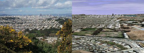
Google Earth is getting better and better and will soon be almost as good as actually being there. Don’t beleive me? I decided to pick a couple of shots and line up the same view in Google earth to compare. This first photo is from San Bruno Mountain (original photo here), showing the San Francisco skyline:

Google Earth vs. Reality - San Francisco

You should definitely click through to see the full-sized version. The version on the right is missing the flowers in the foreground and the clouds are a little different but otherwise it’s very recognizable.

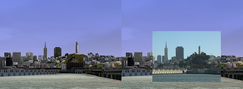
Here’s another shot of San Francisco, this one from the bay (original photo here). I thought this would show off the detail of some of the 3d buildings in Google Earth. I had a hard time lining up a large screenshot because the photo was taken at 8x zoom, but you get the idea.

Google Earth vs. Reality - San Francisco from the Bay

Again, you should click though to the full sized version to get the full effect.

What do you think? Will Google Earth evolve to the point where no one will ever need to travel? My guess is that people will still get wanderlust and until Google unveils a food modem you’ll have to go get the sourdough yourself.

Let me know if you liked these in the comments and I’ll do a few more.

The Art of Information Graphics

I recently ran across a couple of really great examples of how information can be conveyed dramatically with infromation graphics and one example of how to fix graphics that aren’t so good.

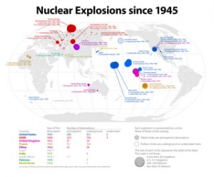
First, from the Radical Cartography project, a map of all nuclear explosions since 1945.  This map encodes a lot of information fairly simply – we can see where nuclear tests have taken place, countries are indicated by color, and blast yield is indicated by size.  Click on the image to see the full version.

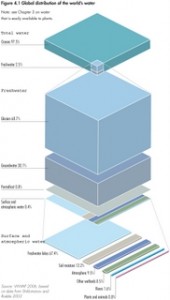
Next, from the United Nations Environment Programme’s Global Environment Outlook report, you can see a great illustration of how little of the world’s water is freshwater and how little of that is readily available in rivers and lakes.  Click on the image to see the full-sized version.

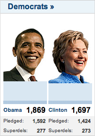
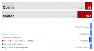
Why point out good example of information design?  Because even the professionals get it very wrong a lot of the time.  Bob Nystrom wrote a great post about how little information is presented in CNN’s chart of the delegate totals for Hillary Clinton and Barack Obama.  Here’s their version:

Without looking at the numbers, can you tell who’s in the lead?  Can you tell how close the race is to the end?  Do you read the bars left-to-right or up-and-down?  Here’s Nystrom’s improvement:

Everything becomes clearer.

Got any good (or bad) examples?  Post them in the comments below.