Category Archives: Blog

Academic Papers Artwork baby names Blog blogging democracy Design ethics Facebook firefox Flickr folksonomies Google Google Docs Google Spreadsheets how-to information-architecture information-retrieval information design internet iphone journalism listserv mailing list maps mass media Online News Papers Photography plugin poll social-bookmarking social networking social software spam tagging trust Twitter Usability web-development Web2.0 webspam web standards WordPress Writing

The Cleveland Web Standards Association, Helvetica, and videoconferencing

If you are a web developer or designer in the Cleveland area, I highly recommend dropping by the Cleveland Web Standards Association meetings. They just launched a new website, including a great aggregation of local web development blogs.

I started going to meetings last year and I have to say it’s a great group of people that host some really interesting discussions and speakers. And I’m not just saying that because they let me give a presentation a few months ago.

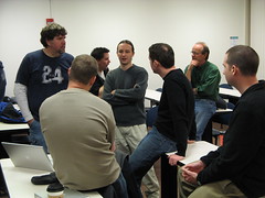
At the last meeting Eric Meyer took some photos – one makes me look really important:

CWSA Afterchat

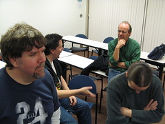
In the other, it looks like I dozed off in the middle of the discussion:

CWSA Afterchat

Oh well. The group screened the film Helvetica, which is the best movie I’ve ever seen about a typeface. I’d recommend it for anyone who has an interest in design, typography, or even 20th-century history.

Since I’ve moved out of town I won’t be able to make it to too many meetings in person. I want to set up videoconferencing, anyone have any recommendations for web cams, software, or services? I’m looking for something that is extremely easy to use, since my parents want to be able to do video calls too. I’ve heard some good things about Skype. Any thoughts?

The first Jason in the Jason Morrison Dot Net Project

Years ago, before social networking sites like MySpace and Facebook were all the rage, I registered this domain name for my resume and portfolio. At the time I the .com was taken so I chose jasonmorrison.net instead. But my resume is not much of a network, so I thought – why not make a network of all the world’s Jason Morrisons?

The project has officially now begun with the addition of Jason Morrison 1, a graphic artist and web designer from Atlanta Georgia. Follow that link to read his answer to five questions or check out his blog.

The usability and design of two warning labels

Usability and design aren’t just concerns for web developers.  They can make a real impact in the use and usefulness of physical products as well.

Warning labels are a great example – you can’t buy anything these days without some kind of warning label, and they are visual design elements intended to convey important information to buyers and users.  I ran into two great examples in the course of packing up and clearing out our house.

Example number one is from a big plastic storage tub.  It’s a great example of both usability and design, though the actual message might seem a bit silly.  Do people really need to be warned not to seal their children inside airtight containers?
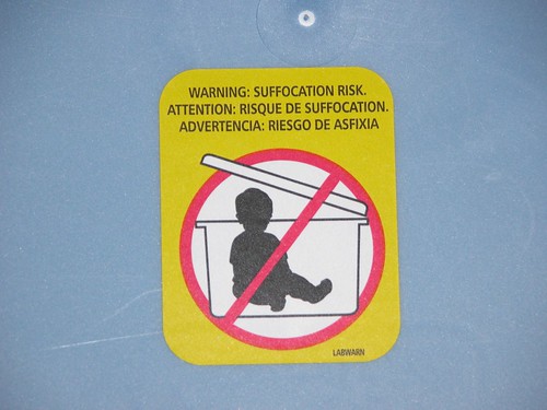
A clear warning - do not store baby in plastic tub

It’s great from a design standpoint because it is clean, puts clear emphasis on the important diagram, and uses bright, attention-grabbing colors.  Any parents poised to place their toddler in the bin will not doubt see the label before recklessly replacing the lid.  It’s a good usability case because it conveys information very clearly and effectively-the silhouette kid is immediately recognizable and it uses common conventions such as the red circle and slash to mean “NO!”

The second example is…  well, strange and off-putting.  We might laugh at the thought of tupperwared toddlers but fireworks obviously pose some danger.  This series of warning messages from the back of a box of fireworks is, well…  take a look for yourself.  I recommend clicking on the image to zoom in in Flickr.

Strange fireworks warning label with creepy inhuman cartoon characters

So what could have been improved from a design standpoint?  For one thing, it would help if the coach and the two children in the second panel weren’t wearing what appears to be ghoulish, grimacing deathmasks.   They look like a cross between some misguided ventriloquist’s dummy and the clown that haunts the nightmares of every five-year-old child.  Cartoons caricatures can be very effective in warnings because we can remove unneeded visual detail to focus on what’s important and because people are accustomed to following short narratives in the style of comic strips.  But not if they are so ugly.

What are the usability problems?  Let’s start at the top.  The phrase “Common sense coach reminds you to…” isn’t quite as clear and gripping as “Warning: suffocation risk” in the first example.  The idea of using cartoons to illustrate each point is good, but the actual illustrations miss the point.  Without the text, do you think you could figure out the meaning of each of these?

For more examples of how usability and information design impact the real world, see The Design of Everyday Things by Don Norman.