Category Archives: Usability

Academic Papers Artwork baby names Blog blogging democracy Design ethics Facebook firefox Flickr folksonomies Google Google Docs Google Spreadsheets how-to information-architecture information-retrieval information design internet iphone journalism listserv mailing list maps mass media Online News Papers Photography plugin poll social-bookmarking social networking social software spam tagging trust Twitter Usability web-development Web2.0 webspam web standards WordPress Writing

Thoughts on Blog Usability

DSC_0723 I’ve been kicking around the idea of redesigning my homepage and blog, though I’m not sure I really have the free time to do it. To start, I thought I would to put down a few thoughts about applying usability principles when designing blogs.

When you starting thinking about usability it’s temping to jump right into lists of principles and rules of thumb. It’s a little silly applying Fitt’s Law when you haven’t even established what you want your site to accomplish in the first place. So what, generally, do you want your blog to do?

Personal Goals

  • Share thoughts and work with others
  • Collect a body of work to represent myself (like a portfolio)
  • Collect information for later discovery (by myself and others)
  • Provide an outlet to continue practice writing
  • Allow others to communicate with me and comment

If you’re creating or redesigning a blog for a company, the goal set may be very different. Below are some examples that don’t actually apply in my case.

Business goals

  • Communicate with customers
  • Build long term relationships with customers
  • Produce quality content to drive search traffic
  • Generate revenue through advertising
  • Etc.

Many projects don’t even get this far before the graphic designers and web developers are already making mock-ups, but we still have one more important step to do. We know why you’re building a blog, but why are users coming to it?

Continue reading

Web Video Usability Review: South Park Studios

After a few years of Youtube showing the world how to do video on the web, lots of traditional broadcasters and studios have started putting their content online. Part of the reason is to try to steal YouTube’s thunder – a more market-friendly tactic than just lawsuits. Many of these sites are trying to figure out an advertising model and make money, while others are obviously trying to get viewers more engaged by joining social networks, making mash-ups, etc.

But enough about their goals, what about user goals and experience? In web video the content may be king but usability is almost as important. If your user interface is difficult, confusing, or unpleasant, users will leave your site to get the content elsewhere.

So I’m going to try to do a usability review of various web video sites over the next few weeks. These won’t be formal reviews with user tests and cool eye-tracking heatmaps. Instead I’ll point out some user goals and hold up each site to the same rubrick.

The first site: SouthParkStudios.com
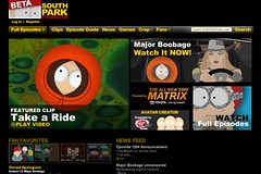
southpark-screenshot

So, what do users want out of web video? I can think of a number of scenarios: finding a particular clip or episode, watching recent episodes, sending a link to a friend or embedding a clip in a blog, and , well, just enjoying the show.

Selection

Score: 4 out of 4 points. This site has everything – every show from every season.

Finding Particular Videos

Method: I’m taking a cue from the creators of Friends – people don’t remember episode names. So I’ll be doing a Google search for the show name and “the one where” and taking the first relevant result. In this case it’s “the one where Ben Affleck has a relationship with Cartman’s Jennifer Lopez hand” (without quotes).

Score: 2 out of 4 points. The search fails, but a simpler query for “Ben Affleck” leads us right to the clips. The full episode is available.

Watching Videos

How easy is it to watch videos? What’s the quality?

Score: 4 out of 4. It’s immediately apparent what to click on to see an episode or clip. You can watch videos full screen and South Park’s animation lends itself well to compressed video. The navigation between episodes is pretty nice, with thumbnails of all episodes for that season along the bottom of the window.

Linking to Videos

Score: 3 out of 4 points. The URL for each clip and episode is available by clicking the “Share” button. Clips open up in the main window so if you can get the link like any other web page. The only lost point is the fact the episodes open in new windows – what is the point? It takes away my browser toolbar and any social bookmaking toolbars or extensions I might normally use.

Embedding videos

Let’s give it a try:

Score: 3 out of 4 points. Once again use the Share button to get the embed code. They lose a point for not allowing embedding of full episodes – they probably have good reasons for not wanting users to do so, but we’re only concerned about the user’s side of things right now.


Advertising

Score: 3 out of 4 points. Ads are shown before the video (for clips) or at two break points about halfway through (for full episodes). Commercials are short and don’t obscure video or interrupt the show more than normal TV commericals would. They lose a point, though, because of the lack of variety – I watched a few episodes and plenty of clips and only saw two different commercials, over and over again.

Audio Experience

I’m going in go with a slightly different scale this time: introducing the patented Bleeding Ear Scale of Web Video Volume.

You may have noticed that some TV stations play their commercials a little louder than the show. The theory I’ve always heard is that they want you catch your attention even if you get up to go to the fridge.

Score:

bleeding earbleeding earbleeding earbleeding ear

Unfortunately, most people don’t watch web video the same way they watch TV – they’re usually sitting much, much closer to the speakers or wearing headphones. The bone-shattering difference in volume between the video and the commercials on SouthParkStudios.com earned the site four bleeding ears.

Total score: 19 out of 24 points, with a special note to dive for the volume button whenever an ad is coming up.

The usability and design of two warning labels

Usability and design aren’t just concerns for web developers.  They can make a real impact in the use and usefulness of physical products as well.

Warning labels are a great example – you can’t buy anything these days without some kind of warning label, and they are visual design elements intended to convey important information to buyers and users.  I ran into two great examples in the course of packing up and clearing out our house.

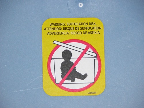
Example number one is from a big plastic storage tub.  It’s a great example of both usability and design, though the actual message might seem a bit silly.  Do people really need to be warned not to seal their children inside airtight containers?

A clear warning - do not store baby in plastic tub

It’s great from a design standpoint because it is clean, puts clear emphasis on the important diagram, and uses bright, attention-grabbing colors.  Any parents poised to place their toddler in the bin will not doubt see the label before recklessly replacing the lid.  It’s a good usability case because it conveys information very clearly and effectively-the silhouette kid is immediately recognizable and it uses common conventions such as the red circle and slash to mean “NO!”

The second example is…  well, strange and off-putting.  We might laugh at the thought of tupperwared toddlers but fireworks obviously pose some danger.  This series of warning messages from the back of a box of fireworks is, well…  take a look for yourself.  I recommend clicking on the image to zoom in in Flickr.

Strange fireworks warning label with creepy inhuman cartoon characters

So what could have been improved from a design standpoint?  For one thing, it would help if the coach and the two children in the second panel weren’t wearing what appears to be ghoulish, grimacing deathmasks.   They look like a cross between some misguided ventriloquist’s dummy and the clown that haunts the nightmares of every five-year-old child.  Cartoons caricatures can be very effective in warnings because we can remove unneeded visual detail to focus on what’s important and because people are accustomed to following short narratives in the style of comic strips.  But not if they are so ugly.

What are the usability problems?  Let’s start at the top.  The phrase “Common sense coach reminds you to…” isn’t quite as clear and gripping as “Warning: suffocation risk” in the first example.  The idea of using cartoons to illustrate each point is good, but the actual illustrations miss the point.  Without the text, do you think you could figure out the meaning of each of these?

For more examples of how usability and information design impact the real world, see The Design of Everyday Things by Don Norman.