Tag Archives: academic research

baby names Beautiful Soup folksonomies Google Google Scholar information-retrieval journalism maps memory distortion online-journalism partisanship psychology research screen scraping SPSS statistical analysis statistical significance

How to get Google search results for academic research

A few years ago, before I was a Googler, I was a grad student doing research on information retrieval. I wanted to compare the results of Google and other search engines with folksonomies form social bookmarking sites. It sounds pretty simple – Google does lots of internal search quality studies, so it’s not too surprising that outside researchers would want to execute lots of queries and use the results in their data.

The way I did it was… not optimal, to say the least. I wrote a bunch of PHP code, spaced out participant sessions, etc. to make sure I could get results back. Google tries to make sure that spammers aren’t scraping search results to generate webspam, so any kind of scraping with cURL, Beautiful Soup, etc. can result in a big pile of failure.

The way I did it wasn’t the right way or the easy way, so when I got the job I made a mental note to ask around for the best way to get search results. Then I forgot all about it until an email exchange with Gary Warner of CyberCrime & Doing Time fame.

It turns out Google has a great University research program and API. You have to apply for registration and let us know who you are, what school you’re affiliated with, and what you plan to study. Assuming everyting checks out you’ll get access to a pretty nice API. There’s a some example Python code but you could just as easily use PHP, Java, or whatever to consume the XML responses.

And that research I was doing? I recently noticed that my paper has been cited 7 or 8 times, according to Google Scholar. I used to joke that I had written the least influential paper in the history of academic publishing, but I guess I can’t claim the title anymore. Scopus only shows 4 citations so I will remain humble anyway.

Baby Name Significance (and other gratuitous statistics puns)

Twisted tree branches

Now that we have more than 10,000 votes in our baby name poll I can start doing some basic statistical analysis.  One of the things I’d like to do is figure out which names are popular in our poll, but still relatively unique compared to all those other babies being named out there.

Before I get to that, though, I want to make sure that our vote totals are significantly different from random.

Heads up:  What follows is a basic intro to some concepts in statistics that I’m writing mainly to keep myself sharp.  I haven’t done much research recently and I don’t want to get rusty.  Feel free to read along, at the end I’ll show you how to detect the influence of Australians.

Since the data for names included in the poll is completely different from the write-in votes, we’ll concentrate on the pre-selected names for now.

Continue reading

Map App of the Day: A genetic map of Europe

I’m a bit of a map geek and a big fan of using maps to convey information geographic and otherwise, so I’m starting a new series of posts – Map App of the Day.  I’ll highlight either a mapping web application or an application of mapping in information design that’s interesting, innovative, or just plain strange.

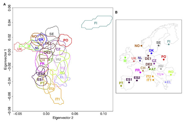
The New York Times had a brief article about a new study of genetic relationships between peoples in Europe.  The paper, by Lao et al., looked at genotype data from more than 2000 individuals spread throughout Europe.  The map on the right shows the normal geographic map of Europe, while the one on the left maps the genetic relationships between countries.

Here’s a link to a larger version on Current Biology’s web site.

The genetic map is a great example of why you should always consider mapping to illustrate data with a geographic component, and why you should always consider breaking the rules a bit  to get a good representation (most maps don’t show countries overlapping, for example).

This is also a great illustration of how permeable and impermanent national borders really are.  It would be interesting to see the same analysis done with distinctive populations like the Basque in Spain and the Sami in Finland added.

This also brings up with two non-mapping issues about journalism and research.  First off, the NYT article didn’t bother to actually link to the journal article, the researcher’s websites at their respective institutions, or any of the other places that readers would need to go to follow up on this paper or get more detailed information.  Why not?

Second, when I searched for Current Biology I was delighted to see that the journal publishes everything online, available via regular Google search, rather than hiding behind some expensive and proprietary publication database.  Open access is very cool.