Tag Archives: Design

calendar cwsa design constraints graphic-design helvetica home page information design listserv NASA news Outlook propaganda redesign site-navigation skype Sri Lanka tag clouds videoconferencing

I Heart Pluto

Poor Pluto. Once a planet, now demoted to dwarf planet status.

I’m not a “Pluto is a planet” partisan, but when NASA’s New Horizon mission took this close-up photo of Pluto, I knew I had to have this shirt. Now you can have one too:

NASA did all the real work sending a spacecraft 3 billion miles to take the picture, so I’m publishing this with a Creative Commons license. Go ahead and make your own T-shirt, stickers, coffee mug, whatever.

If you are too lazy to make your own, I have T-Shirt, Stickers, and Coffee Mugs available for pre-order on CafePress.

Creative Commons License
I Heart Pluto by Jason Morrison is licensed under a Creative Commons Attribution 4.0 International License.
Based on a work at http://www.nasa.gov/image-feature/pluto-is-dominated-by-the-feature-informally-named-the-heart.
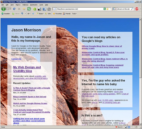
Redesigning my home page, what do you think?

A while back I wrote some early thoughts about redesigning my blog for usability. I haven’t had much time to work on my blog since then, but to be honest my homepage was in even more dire need of attention.

The design considerations for my home page are a little different from my blog – I don’t expect anyone to come back to my homepage again and again, looking for informative articles or useful info. The use case for the home page can be stated pretty succinctly: “who is this guy, and what does he do?”

I’m also operating under the design constraint of what I can get done while our 8-month-old is napping. This means a very simple layout – it takes time to come up with lickable web2.0 buttons and reflections. I’d like the page to be visually interesting, though, which is why I decided to use a big freaking photo in the background.

Normally I would try to avoid such a bandwidth-sucking design but bandwidth doesn’t seem to be the problem it used to be. I have some ideas on how to trim down the image size without impacting the design too much that I’ll share once I’ve got it up.

Here’s a screenshot of the first draft:

screenshot-1

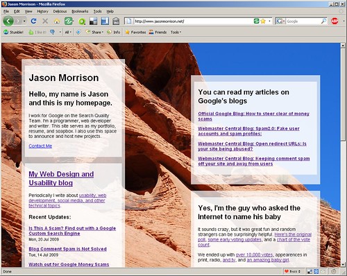
And here’s what it looks like, as of this post:

screenshot-2

What do you think? I’m specifically wondering:

  • Should I put a photo of myself on my homepage?
  • Any typography ideas? Right now everything is Helvetica (or Arial, if Helvetica isn’t installed).
  • The content boxes are floats, and they change position depending on the window size. Should I lock them down?

Propaganda Maps – Live, Interactive, on the Web

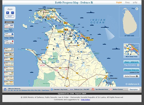
Before reading further, take a look at this impressive map web app from the Sri Lanka Ministry of Defence: http://www.defence.lk/orbat/Default.asp. Below is a screenshot of the main map.

Interactive map created by the Sri Lanka Ministry of Defence

What’s your initial impression? It’s certainly well-made. The graphic design is very professional, the map is interactive, allowing users to turn features on and get more detail. There’s also an animated timeline map of the recent conflict in the north that shows the progression of troops and photos from the various towns.

Continue reading