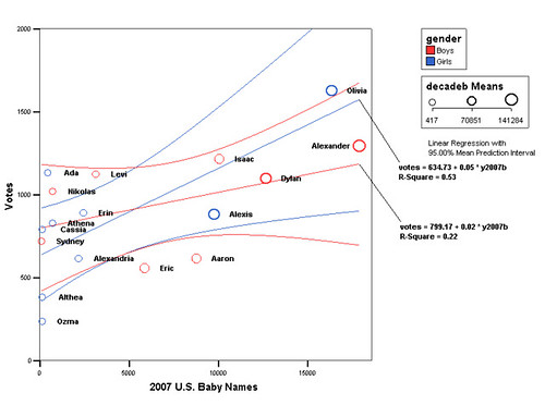
We’re letting the whole Internet vote on the name for our baby, so it might seem a little strange that I’m posting about picking a name that’s unique. Why bother with a poll if you don’t want a popular name? What does uniquely popular mean, anyway?
Looking at the data right now, Alexander is comfortably in the lead. But Alexander is also a very popular name in general right now – it was the 9th most popular name for boys in 2012 according to the U.S. SSA. So, I’d like to see if some names are getting more votes in our poll than you would expect just by general popularity.
I did a similar analysis when we did this for my daughter five years ago. Back then I used SPSS and a little more statistical rigor, but I haven’t had a chance to play around with R to do something similar yet. For now I’ll stick to what I can do in Google Spreadsheets.
Here’s a plot of each name, showing the number of votes in our poll vs the number of babies with that name in 2012:
So what does this tell us? First off, the names seem to line up more or less on a line going up and to the right. This means there’s probably a correlation between our poll and popularity in the U.S. Google Spreadsheets has a function to give you the correlation coefficient called CORREL(). Right now this is 0.69, which is a pretty strong correlation.
Second, if we guesstimate where we would have to put a straight line to best fit these points, we can see which names are above the line – right now, it’s Nikola, Luka, and Finn, with Soren maybe just peeking over the top. If we want to pick names that are uniquely popular in our poll, those are good choices.
I’ve plotted the U.S. Babies in 2012 totals on a log scale for two reasons – first, it’s much easier to read this way, and second, it doesn’t look like baby names are distributed very evenly:
This is from U.S. SSA data again. In this chart you can see that a very small number of the most popular names (at the left side of the graph) are given to a very large number of babies. Looking toward the right of the graph, there’s a very long tail of many names given to much smaller numbers of babies.
This looks like it might be a Zipf distribution, which is a pretty common distribution for data like wordcounts and website popularity. If we shift that graph to a log scale it starts to look more like a straight line.
By the way, if you haven’t voted on our baby name poll yet, go ahead and vote now – this baby is coming soon!


