Tag Archives: timeline

baby names Design Google Google Docs information design interactive map maps news poll propaganda Sri Lanka time series chart transparency video-games

See the Trending Baby Names in our Poll

One of the nice things about using Google Forms to name your baby is you can use the built-in charts and reports. Here’s a fun timeline chart showing how each name has collected votes over time:

The graphic is a little small here, so here’s a larger version: http://www.jasonmorrison.net/static/timeline.html.

For example, you can see that Finn just surpassed Isaac on the 15th. Also Xavier, Nikola, and Luka have been battling each other throughout the whole poll.

If you haven’t voted, you still have time – but hurry, the baby is due in May. Click here to vote.
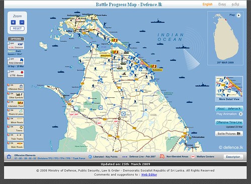
Propaganda Maps – Live, Interactive, on the Web

Before reading further, take a look at this impressive map web app from the Sri Lanka Ministry of Defence: http://www.defence.lk/orbat/Default.asp. Below is a screenshot of the main map.

Interactive map created by the Sri Lanka Ministry of Defence

What’s your initial impression? It’s certainly well-made. The graphic design is very professional, the map is interactive, allowing users to turn features on and get more detail. There’s also an animated timeline map of the recent conflict in the north that shows the progression of troops and photos from the various towns.

Continue reading